When you think about your favourite brand, what’s the first thing that comes to mind? The logo. And what’s the most striking part of that logo? The colour. From the golden arches of McDonald’s to the deep blue of Facebook, colour isn’t chosen randomly—it’s carefully designed to trigger emotions and drive decisions.
This isn’t just good design. It’s science. The psychology of colours explores how colours influence perception, emotion, and behaviour. In this post, I’ll dig into the science, cultural meanings, and practical uses of colour psychology in marketing, design, and daily life.
What is Colour Psychology?
Colour psychology is the study of how different colours affect human behaviour and decision-making. It looks at the emotional and cognitive responses people have when exposed to certain shades.
According to Frontiers in Psychology (2015), colours affect our attention, memory, and even arousal levels. This means the red “SALE” sign at your favourite store isn’t just catching your eye—it’s triggering urgency and excitement in your brain.
Colours and Emotions
Emotions and colours are deeply connected. Our brains process colour faster than words, and research shows that 90% of snap judgments about products are based on colour alone (Management Decision Journal, 2006).
Here’s a closer look at what different colours typically mean:
- Red: Energy, passion, urgency. Raises heart rate and creates excitement. Used in sales, sports, and food branding.
- Yellow: Optimism, happiness, caution. Grabs attention but can cause visual fatigue if overused.
- Blue: Trust, calmness, professionalism. The most popular colour globally. Lowers blood pressure and increases feelings of safety.
- Green: Growth, balance, health. Associated with nature and money, making it ideal for wellness and finance brands.
- Purple: Luxury, creativity, spirituality. Historically tied to royalty, now often used by beauty and high-end brands.
- Black: Power, elegance, authority. Common in luxury fashion branding. It can also feel heavy if not balanced.
- White: Simplicity, purity, clarity. Used to create a minimalist, clean aesthetic. Popular in modern tech and design.
These emotional responses explain why colours play such a huge role in advertising and branding strategies.
The Science Behind Colour Perception
Why do we associate blue with calm or red with excitement? Three key factors influence how colours affect us:
- Biological responses: Red signals danger or urgency due to its association with blood and fire.
- Cultural context: White symbolises purity in Western weddings but mourning in some Asian cultures.
- Personal experience: Someone who grew up by the sea may find blue soothing, while someone else may feel indifferent.
This mix of biology, culture, and memory makes colour perception complex, but also powerful for communication.
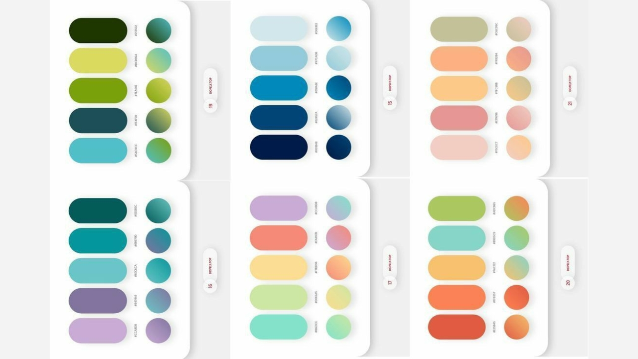
Colours in Marketing
Businesses know colour psychology can directly influence customer behaviour. That’s why major brands stick to specific colour palettes.
- Red in fast food: McDonald’s, KFC, and Coca-Cola use red to stimulate appetite and encourage quick decisions.
- Blue in tech: Facebook, Twitter, and LinkedIn rely on blue to inspire trust and stability.
- Green in eco-friendly brands: Starbucks and Whole Foods use green to emphasise sustainability and health.
- Black in luxury goods: Chanel, Gucci, and Rolex leverage black to communicate exclusivity and timelessness.
A study published in Colour Research & Application (2012) found that colour can increase brand recognition by up to 80%. That’s why companies spend millions testing and refining their colour choices.
Colours and Consumer Behaviour
Different colours don’t just affect brand perception—they also change shopping behaviour.
- Red price tags: Create urgency, leading to impulse buying.
- Yellow accents: Draw attention to promotions and discounts.
- Blue trust cues: Reassure customers in financial services and online shopping.
- Green call-to-action buttons: Increase click-through rates by signalling “go” or approval.
E-commerce studies show that simply changing the colour of a “Buy Now” button can significantly impact conversions.
Colours and Productivity
Colour psychology isn’t limited to marketing. It also influences focus, creativity, and productivity.
A 2009 study from the University of British Columbia found that:
- Red enhances attention to detail (useful for proofreading or accounting).
- Blue boosts creativity (ideal for brainstorming and design work).
In office spaces:
- Blue walls enhance focus.
- Green environments reduce stress.
- Yellow tones encourage innovation.
This is why modern workplaces carefully design colour schemes to optimise employee performance.
Cultural Symbolism of Colours
Colour meanings vary dramatically across cultures. What feels positive in one country may feel negative in another.
- Red: Good luck in China, danger in Western cultures.
- Black: Mourning in the U.S., but rebirth in some African traditions.
- White: Purity in the West, death in India.
- Green: Sacred in Islam, associated with luck in Ireland, and sometimes jealousy in the West.
Global brands adapt accordingly. For example, Coca-Cola uses festive red for Christmas in the West but avoids the same shade in some Asian markets where it might signal bad fortune.
Colour Psychology in Web Design
In the digital age, first impressions often happen online. That’s where colour psychology becomes essential.
- Blue websites feel reliable and professional.
- Minimalist black-and-white sites feel modern and sleek.
- Bright colours improve engagement but can overwhelm if not balanced.
User experience studies show that websites with well-matched colour schemes see longer engagement times and higher trust ratings.
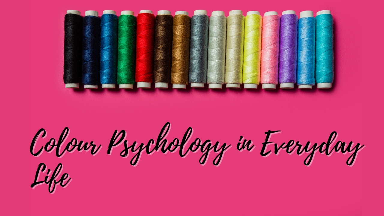
Colour Psychology in Everyday Life
You don’t need to run a business to use colour psychology. It applies to everyday choices:
- Home décor: Blue bedrooms promote relaxation, while yellow kitchens boost energy.
- Wardrobe: Wearing black in professional settings signals authority, while softer tones like green or beige feel approachable.
- Wellness: Colour therapy (chromotherapy) is sometimes used in alternative medicine to influence mood, though evidence remains limited.
Even small adjustments, like painting a workspace or choosing colourful stationery, can subtly impact daily mood and productivity.
Practical Takeaways
Here are a few quick tips based on colour psychology:
- Use red if you want to create urgency or highlight discounts.
- Choose blue if your goal is to build trust and reliability.
- Go with green if your brand connects to health, nature, or finance.
- Lean on black and gold if you want to emphasise luxury and exclusivity.
- Stick to white and minimalism if your goal is simplicity and clarity.
In personal spaces, pick colours that match your emotional goals—blue for calmness, yellow for energy, or green for balance.
Bringing It All Together: Colours and the Human Mind
Colours aren’t just decoration. They’re a psychological tool that shapes how we feel, how we shop, and how we connect with the world. From boosting workplace creativity to driving billion-dollar branding strategies, the psychology of colours is everywhere.
The next time you notice a logo, a website design, or even the wall colour in your living room—ask yourself: How does this colour make me feel? Chances are, the answer lies deep in the psychology of colours.
